
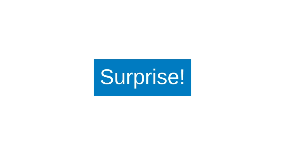
angular-surprise-button is a single AngularJS component, packaged for npm. Put <mbm-surprise-button> in a template and you get a blue button with your own label inside it. Press it and it plays a one-second tada animation: it shrinks a little with a slight tilt, then grows and rocks from side to side before settling.
It was made in March 2017 as the example project for a post on the Made By Munsters blog about building Angular modules with webpack and npm. The post is no longer online. The repository has two commits, five minutes apart, and the package hasn’t changed since.
The animation
The animation lives in the stylesheet and runs on the button’s :active state, so it plays while the button is held down. These frames come from a small local page that loads AngularJS 1.6.3 and the bundle from the repository’s dist folder, with the animation paused at set times for each screenshot.


How it’s built
The component is a template, a transclude flag and an empty controller class. surprise-button.module.js imports it and the stylesheet, registers it on a module named mbmSurpriseButton, and exports that name.

The styles are 73 lines of SCSS, most of them the keyframes for the tada animation, with -webkit- prefixed copies of each rule.

webpack 2 bundles everything into one CommonJS file, dist/angular-surprise-button.js, with a source map. The Sass goes through sass-loader, css-loader and style-loader, so the CSS is compiled into the bundle and added to the page in a <style> tag when the module loads. There’s no separate stylesheet to include. AngularJS is only a dev dependency: the bundle uses the angular global from the page.
On npm
Version 1.0.0 went to npm on March 18, 2017 (UTC), and 1.0.1 followed a few minutes later with the README and repository links. The bundle is the same in both, and it’s the same file that’s in the repository.
npm install angular-surprise-buttonThe package’s default export is the module name, so you can import it and list it in your app module’s dependencies, then use <mbm-surprise-button> in a template. Load AngularJS on the page first.
The creation date shown here is the GitHub repository’s UTC creation date. The screenshots were captured from a local demo page that loads AngularJS 1.6.3 and the repository’s built bundle, with Surprise! as a sample label, and the code cards show the repository’s source files.